Very simple level schemes in Excel
I worked out a very quick and easy way to generate level schemes in Excel, based on a query from one of the other students in the group. Normally I would resort to something like the astonishing TikZ for this sort of task, however our group is very much a Microsoft Office ‘What You See Is A Metaphor For Cosmic Horror‘ group and recommending that a colleague learns two new markup languages to produce a figure is probably not helpful in the short term. One of the issues with charting energy levels in Excel is that levels are typically represented by horizontal bars connected at their vertices with lines representing transitions. Whilst Excel does have a horizontal bar as a marker, it possesses two show-stopping limitations:
- It is only uniformly scalable, and can only be scaled so far – we cannot make it anywhere near wide and thin enough to look normal.
- It is only a marker for the chart vertex. Thus, lines connecting to the marker will meet at the center, which looks goofy.
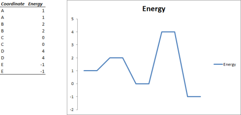
An obvious workaround is to define each point in our chart twice, separated by some horizontal distance so that our chart has plateaux:
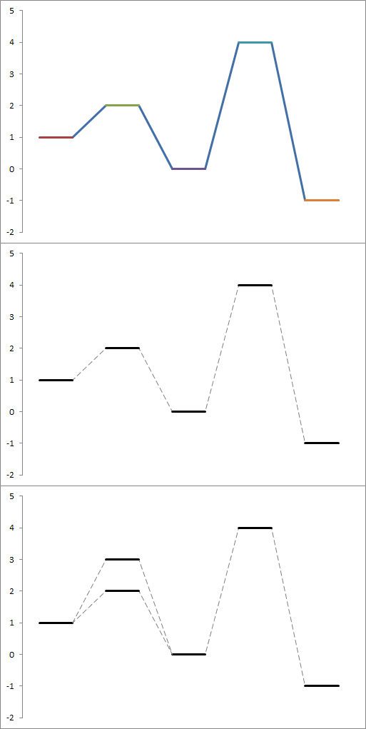
This is okay in that the levels are roughly the conventional shape, however it would be nice if we could break the style of the chart up into clearly defined levels and transitions. This turns out be be rather easy to achieve by creating extra series for each level, containing only two points. Each series turns up in your chart as bar overlaid on the first series, in Excel’s characteristic tutti-frutti colours. By tweaking the colour and style of the first series to a dashed grey, and simply making all of the other series black, we can make something Ed Tufte would be proud of wouldn’t puke at.
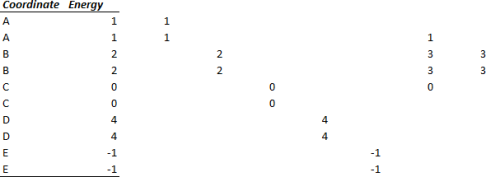
We can add multiple levels at the same coordinate (for instance, separating out spin state energies) by simply creating two more series, like so.
What about labels? Well, you can add those in manually, or you can expand each series to three points per reaction coordinate, only putting a coordinate label in the second row of each.
I hope someone finds this useful!
Posted on 14/03/2012, in Uncategorized and tagged Charting, chemistry, computing, physics. Bookmark the permalink. 6 Comments.


I found it useful! Pretty clever and simpler than my old Excel approach. I think I will reblog this if you are ok with it.
Have a nice day!
I’d be honored 😀
Reblogged this on Dr. Joaquin Barroso's Blog and commented:
This is the first time I reblog a post from a fellow computational chemist and the reason why I do it is because of its beautiful simplicity and usefulness. Given the scope this blog has taken I think this post becomes most appropriate. This post will show you how to create an energy level diagram using nothing but MS Excel.
Kudos to ‘Eutactic’, from Australia, for coming up with a nice solution to this problem. Check out his blog at eutactic.wordpress.com.
Thanks for letting me repost it 🙂
Much nicer than my clumsy technique of “make it in ChemDraw”. Thanks for sharing!
Oh wow. I’m only just discovering this now… could have saved a lot of pain. It’s slightly awkward to keeping adding new series, but fiddle enough to set up a good template for it and BANG, job done pretty fast.
Pingback: diagram profil energi sederhana menggunakan LibreOffice Calc « neax502 simple blog