Blog Archives
Very simple level schemes in Excel
I worked out a very quick and easy way to generate level schemes in Excel, based on a query from one of the other students in the group. Normally I would resort to something like the astonishing TikZ for this sort of task, however our group is very much a Microsoft Office ‘What You See Is A Metaphor For Cosmic Horror‘ group and recommending that a colleague learns two new markup languages to produce a figure is probably not helpful in the short term. One of the issues with charting energy levels in Excel is that levels are typically represented by horizontal bars connected at their vertices with lines representing transitions. Whilst Excel does have a horizontal bar as a marker, it possesses two show-stopping limitations:
- It is only uniformly scalable, and can only be scaled so far – we cannot make it anywhere near wide and thin enough to look normal.
- It is only a marker for the chart vertex. Thus, lines connecting to the marker will meet at the center, which looks goofy.
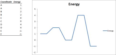
An obvious workaround is to define each point in our chart twice, separated by some horizontal distance so that our chart has plateaux:
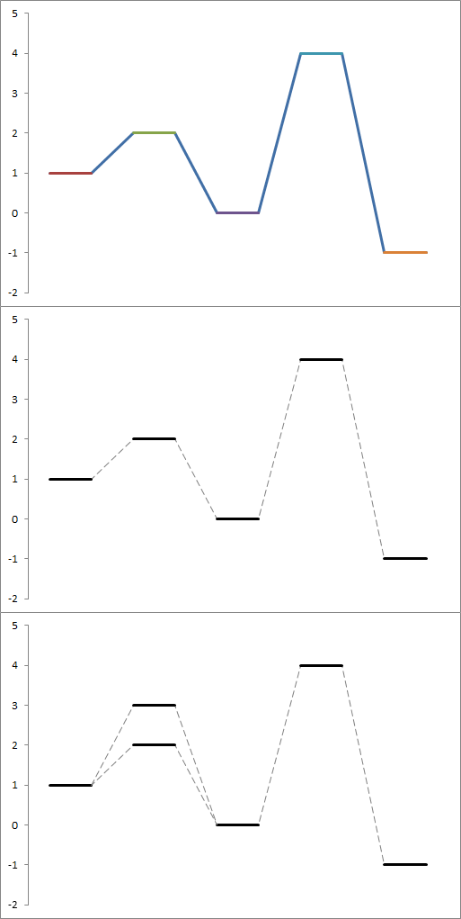
This is okay in that the levels are roughly the conventional shape, however it would be nice if we could break the style of the chart up into clearly defined levels and transitions. This turns out be be rather easy to achieve by creating extra series for each level, containing only two points. Each series turns up in your chart as bar overlaid on the first series, in Excel’s characteristic tutti-frutti colours. By tweaking the colour and style of the first series to a dashed grey, and simply making all of the other series black, we can make something Ed Tufte would be proud of wouldn’t puke at.
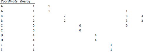
We can add multiple levels at the same coordinate (for instance, separating out spin state energies) by simply creating two more series, like so.
What about labels? Well, you can add those in manually, or you can expand each series to three points per reaction coordinate, only putting a coordinate label in the second row of each.
I hope someone finds this useful!
Energy level ladder plots made trivial
I have written a simple but fairly nice script for generating energy level ladder plots. It uses matplotlib on python.
You feed it a file with some energy parameters and pairs of energy levels and descriptors and get a consistent graph out of it which can be saved as a raster or vector graphic. These plots are sort of hard to do consistently in Excel and the like.
You can grab the files here.
The archives consist of the script, some examples and the manual. You will need python 2.6 and matplotlib. Older versions may work but are untested.
I hope someone finds this useful, as I certainly do.
The package is released under the GPL.
Edit: I have updated the package to fix a bug which interfered with rendering of *.pdf files in Adobe Reader 8
Cosmic rays and RAM
I’m writing up some stuff on tiny numerical discrepancies in some hardware benchmarks I’ve been performing. At the moment I’ve chalked them up to pseudorandom numbers being introduced into the calculations by the algorithm in use or maybe slight differences in floating point arithmetic between the ostensibly identical compute nodes I’m testing.
I have written a little bit on why memory corruption is unlikely to be the culprit, and remembered something I read a while back about cosmic rays being a nontrivial source of – ahem – random bit-flips in RAM without error correction.
This gets me thinking – would horizontal vs. vertical orientation of RAM DIMMs change the likelihood of cosmic ray collision to any significant degree?
It’s my understanding that most cosmic rays / secondary shower particles that reach the ground come in at steep angles (less intervening atmosphere to potentially interact with), so I’m wondering if in the olden days anyone mounted RAM/other components edge on with respect to this preferred direction of attack…
(I recall reading Dan Rutter discussing the cargo cult computer configuration (CCCC!) that went on in days gone by, when people always span up hard disk drives on the same axis (with respect to gravity) they were formatted in. Very interesting, not sure how necessary it actually would have been)
Representing spin graphs in GraphViz
I was recently looking for a way to represent systems of interacting spins (e.g. to depict Heisenberg coupling between metal centres) and determined that there had to be some kind of deep, transcendental, graph-theoretic truth underlying coupled metal centres. After meditating hard I had gained no real insight, apart from the fact that I could represent these systems as undirected graphs, with each node representing a center and each edge representing a linear combination of exchange pathway contributions. Happily, there exists a program that is capable of attractively rendering graphs of nodes and edges, called GraphViz. GraphViz is seemingly mostly used for representing IT networks and FSMs, but it’s general enough to depict any kind of directed or undirected graph. I set to work making my dream come true:
graph cadisp1 {
 graph[bgcolor="transparent"];
 node [fontname="calibri", fontsize="14.00", shape=circle, style="bold,filled" fillcolor=white height="0.8"];
 edge [style=bold];
 splines=true;
 overlap=false;
 {node [height="0.8", shape=circle, style="bold,filled" fillcolor=lightgray] B1 B2 B3 B4 C1 C2 C3 C4 D1 D2 D3 D4}
 A1 [label=" 2↑ "];B1 [label="3/2↑"];C1 [label="3/2↑"];D1 [label="3/2↑"];
 A2 [label=" 2↓ "];B2 [label="3/2↑"];C2 [label="3/2↑"];D2 [label="3/2↑"];
 A3 [label=" 2↑ "];B3 [label="3/2↓"];C3 [label="3/2↑"];D3 [label="3/2↑"];
 A4 [label=" 2↑ "];B4 [label="3/2↓"];C4 [label="3/2↓"];D4 [label="3/2↑"];
 B1 -- C1 -- D1 -- B1;
 A1 -- B1;
 A1 -- C1;
 A1 -- D1;
 A2 -- B2 -- C2 -- A2;
 D2 -- A2;
 D2 -- B2;
 D2 -- C2;
 A3 -- B3 -- C3 -- A3;
 D3 -- A3;
 D3 -- B3;
 D3 -- C3;
 A4 -- B4 -- C4 -- A4;
 D4 -- A4;
 D4 -- B4;
 D4 -- C4;
}
And out pops an automatically formatted SVG file. This was quicker to write than it would have been to construct by hand, and required only a little bit of finishing up in Inkscape to seal the deal:

Spin graphs for a tetranuclear clustery thing
Irritatingly, GraphViz requires html character encodings for non-ASCII characters, necessitating the &# codes to render ↑ and ↓ respectively. I see that WordPress has automatically formatted these codes… Finishing up consisted of shading the dissimilar spin states and using continuous or dashed edges to highlight parallel and antiparallel relationships between centres (all single-determinantial!). Optionally, I could label the edges to show the magnitude of the coupling as some multiple of pairwise J values. I feel that the shading and dashing helps better bring out the symmetry of the broken symmetry states, so that I only need to stare slack-jawed for a short time before I know what to stipulate the symmetry as in the computational chemistry software of my choice after I’ve blu-tacked the graph to my cube (hint: clockwise from top left it’s Cs, Cs, C3v, C3v).
The geometry of the cluster in real life is elegant and approximately tetrahedral, however this could also serve as a representation of a tetranuclear cluster with trigonal planar geometry and the appropriate exchange pathways (I have been told such systems are known) or indeed any other crazy asymmetric geometry with the necessary exchange pathways. Edges don’t represent bonds, and as such they may stand in for any number of intervening ligands working in concert for the full pairwise couplings experienced by the metals. In the end however, I will probably decide that I cannot realistically put these into a document on the basis that they are simply too abstract, or worse, too pretentious (these things tend to go hand-in-hand) for people to like. Fantasies of inventing a popular diagram type aside, I acknowledge that people – myself included – usually dig more concrete representations that can be recognised at a glance. For this, traditional molecular stick diagrams – perhaps with attendant spin arrows – serve admirably and are ubiquitous in literature.
Oh well, we shall see.


